I have created a vlog in which I describe the different media technologies I used in the construction and research, planning and evaluation stages of my coursework.
Saturday, 9 March 2013
Thursday, 7 March 2013
Evaluation 3- What Have I learned from audience feedback?
Below is a video i made of my class giving me some feedback on my video
good locations and over all mise en scene for genre
"resloving road"
colour contrast (high key vs low key lighting)
simplicity/ natural (against wall) goes with genre
editing to the beat
old film effect goes with genre
suits indie/ alternative pop genre
catchy song
good acting
story interlinks
good use of colour correction and changing colours for different scenes
Lip syncing good at some points...this means that at other times the lip syncing is slightly off. I see this now in my video and if i were to do it all again, would perhaps use less lip syncing shots for the purpose of getting them to be in sync with the music as it can be very tricky!
Overall i would say i am very happy with the feedback i have recieved, statistically and verbally.
However from the feedback i have realized that if i were to do it all again there would be a few things i would do differently. I would have used less direct lip syncing ( for editing purposes as it can be very difficult to get it in sync with the music) I think i would also have shot another scene at a different location, just to add a bit more variety. Despite this, i am very pleased with the outcome and feedback from my video !
Positive feedback:
good locations and over all mise en scene for genre
"resloving road"
colour contrast (high key vs low key lighting)
simplicity/ natural (against wall) goes with genre
editing to the beat
old film effect goes with genre
suits indie/ alternative pop genre
catchy song
good acting
story interlinks
good use of colour correction and changing colours for different scenes
Negative Feedback:
Lip syncing good at some points...this means that at other times the lip syncing is slightly off. I see this now in my video and if i were to do it all again, would perhaps use less lip syncing shots for the purpose of getting them to be in sync with the music as it can be very tricky!
Overall i would say i am very happy with the feedback i have recieved, statistically and verbally.
However from the feedback i have realized that if i were to do it all again there would be a few things i would do differently. I would have used less direct lip syncing ( for editing purposes as it can be very difficult to get it in sync with the music) I think i would also have shot another scene at a different location, just to add a bit more variety. Despite this, i am very pleased with the outcome and feedback from my video !
Wednesday, 6 March 2013
Evaluation 2 - How effective is the combination of my main product and ancillary texts?
I have created a prezi in order to identify links within my ancillary tasks and my final video. From this prezi i hope to portray how each of the three products that i have created ( digipak, advert and video) relate to one another and fit together as an effective package.
Monday, 4 March 2013
Evaluation 1- In what ways does my media product use, develop or challenge forms and conventions of real products?

Top Left Shot
This shot of the woods is very in suit with the genre of video that i have. I feel it is a key shot as it conforms to the conventions of my genre also. A similar media product is Ellie Goulding's music video " Guns & Horses"
Top Middle Shot
This shot again is very key in relationship to my video and genre because it conforms to every convention of indie/ alternative pop. It is a beautiful and natural clip, yet layered with a channel mixer effect it is quite creepy, and uncomfortable. This weirdness fits in perfectly with the synergy of most indie/ alternative pop genres products. An example of this being used is in Lana Del Reys music video for Blue Jeans.
Top Right Shot
 This shot is key as it has no added effects to it, and again shows and establishes the protagonist. To the left is a screen shot from Ben Howard's video- Keep Your Head Up. My shot develops this real media clip as the sunlight and lens flare is a prominent feature which is conforming within my genres tendencies.
Mid Left Shot
 This shot is a generic element to my video that i think helps give it that Indie and alternate edge to it. The old film effect follows in suit with genre and most of Lana Del Rey's own music videos and promotional packages. The beach is a location frequently used in music videos of mostly pop , indie and alternative genres videos, but with this added effect i feel that i have managed to combine all three in order to conform with my audiences expectations.
The reason i chose to use old film effect was from an extended love of Lana's videos and synergy which is thought of as vintage and without copying, i tried to portray this feel in my video, which is shown within this screen shot.
Mid Middle Shot
I edited the majority of this section with a pink hue using channel mixer on premier elements. This colour haze i feel uses conventions of real media products from my genre as it adds that little bit of weirdness that usually comes hand in hand with the indie/ alternative pop genre. However despite this thought, I couldn't actually find any real media products from my genre that use this effect in a music video or promotional package. This perhaps means that i am challenging forms of real media products, however i feel that i have developed the concept of "colour haze" from my genres types of synergy, and as " indie/ alternative pop" is a niche market, it still has a large range of possible ideas and effects that could fit under that genre's name. The pose of my protagonist is also conforming to the " wanted weirdness" as the position she is in represents vulnerability.
Left Middle Shot

 I feel this shot of the moon in key as not only the image itself but that upward tilt camera shot that was used to take this clip matches convention of real media products by artists such as Ben Howard, Angus & Julia Stone, Imogen Heap and Bon Iver. The moon can be thought of as to have a symbolic meaning of hope and well being which is likely to appeal to my target audience. This also fits in with conventions of my genre and real media products.
Bottom Left Shot
 I chose this shot to put in my grid as i think the high angle nature of this shot, and the fact that it is a close up links to real media products. For example the high angle shot has been used before within the genre of indie/ alternative pop.
 To the right is an album cover of one of the Kooks albums, and as you can see they have used a high angle shot. The high angle shot again shows connotations of vunerability, which i suppose is a running theme throughout my video and many others of my genre.
Bottom Middle Shot
This close up shot of lips mouthing the words of the song is frequent and popular in many genres of real media products. Lip syncing is also used commonly by artists such as Janelle Monae and Rizzle Kicks.
Bottom Right Shot
 I chose this as a key shot relating to real media products as it is the shot i used for my advert and also in my digipak. Shots taken when the protagonist is not looking at the camera are often used, for example in Rihanna's album cover for her album Loud. I feel the shot of Louisa is very striking, yet reserved and that is hopefully how she is portrayed thorughout my video.
Thursday, 28 February 2013
Finished Video!
Here is the finished edit of my music video. Hope you enjoy!
As you will see i have made a few changes ( mainly in colour) to my video from my first draft. After watching it over again and sharing it around my friends, i began to feel as though all of the different scenes and locations were becoming too blended together with the old film effect, and i felt as though it may have become a bit boring. This is why i chose to add a pink hue to most of the lip lyncing clips to give it more of a diverse colour palette. I used the channel mixer effect in order to do this, and in some clips chose a more white washed palette for example on the first head shot lip syncing clip as i liked to creepy feeling that it portrayed. I also used channel mixer to play around with the colours on the clips of the forest at the beginning and end. I did keep alot of the old film effect on most of the beach scenes, but i think now having the other colours in my video makes the old film effect stand out even more.
As you will see i have made a few changes ( mainly in colour) to my video from my first draft. After watching it over again and sharing it around my friends, i began to feel as though all of the different scenes and locations were becoming too blended together with the old film effect, and i felt as though it may have become a bit boring. This is why i chose to add a pink hue to most of the lip lyncing clips to give it more of a diverse colour palette. I used the channel mixer effect in order to do this, and in some clips chose a more white washed palette for example on the first head shot lip syncing clip as i liked to creepy feeling that it portrayed. I also used channel mixer to play around with the colours on the clips of the forest at the beginning and end. I did keep alot of the old film effect on most of the beach scenes, but i think now having the other colours in my video makes the old film effect stand out even more.
Sunday, 24 February 2013
Digipak/ CD/Abum adverts 5- Advert
Here is the advert print for my promotional campaign. I stuck to colours and fonts that i have used throughout the promtional campaign and digipak, as continiuty is crutial for recognisable purposes. This would most likely to be found within a magazine, and could potentially be used as a print poster to be stuck up in music venues or retailers where my target audience would be found.

Digipak/CD/Album adverts 4- Flat Plan of advert
Here is a flat plan/ sketch of my promotional advert.
I chose to have a headshot of louisa as the main focus of the poster, with big bold righting that stands out, follows in suit with the artists branding and entire promotional campaign. I intend the picture to be out of focus as i like the effect that it gives off and is in sync with the synergy of the video.

I chose to have a headshot of louisa as the main focus of the poster, with big bold righting that stands out, follows in suit with the artists branding and entire promotional campaign. I intend the picture to be out of focus as i like the effect that it gives off and is in sync with the synergy of the video.

Digipak/ CD/Album adverts 3- The importance of a print advert in a promotion of the artist & music
Being the first place an audience member see's the advertising campaign,It will therefore introduce the audience member to the overall synergy of the album .

The print advert tells the audience member imprtant information such as the title and the release date - making it easier for them as they know when and where they can purchase the album ect
A print advert will also potentially attract a wider range of people as the more people who see the advert, means that more people are aware of the advert and some of these people may show an interest in the album and go on the purchase it.
Here is a short animoto explaining the importance of a print advert
Make your own slide show at Animoto.
Saturday, 23 February 2013
Digipak/CD/Album adverts 2- Copy of Advert
I copied one of mumford and sons advertising posters on photoshop as again they have the same genre of music as i am working with.


Below is the real poster

Below is my attempt at copying it on photoshop

Digipak/CD/Album adverts 1-Conventions of CD Advertising
From research of the indie/alternative pop genre i have been able to gather conventions in order to "get it right" Here is an analysis of an advert of the indie/alternative pop genre.
Friday, 22 February 2013
Ancillary Text / Planning 8-My Digipak
Here is my digipak and spine that i created on photoshop. As you can see i have used the light blue colour contrasting with the old film look of my video. I feel the digipak portrays the overall feel of the video.


Thursday, 21 February 2013
Ancillary Text / Planning 7- Digipak flat plan
 One element i forgot to add in on my flat plan is that on the top right hand box i will have the track list and on the back of the digipak i will have my record label name and logo
Wednesday, 20 February 2013
Ancillary Text / Planning 6-How have the sales of CD's changed?

CD sales have dropped dramatically in the last five years due to illegal downloading from the Internet and the popular and easy to do CD burning.
This has caused record companies problems, for example: The Universal Group (one of the largest record cooperation's) had to cut
the sales prices up to 25% in the last two years, in an attempt to increase
sales.
The figures below show the drastic decline in CD sales, going hand in hand with an increase in downloads from the internet.
 Single Sales CD : Downloads
2007 6.6m 77.5m
2008 4.1m 109.8m
 2009 2.5m 148.8m
2010 1.9m 158.6m
2011 1.1m 175.1m
This graph to the left shows the steady increase of digital downloads against the steady decrease in physical CD's. Now in 2013, the digital half of the graph is double what it was in 2010, with digital downloads dominating the way in which we listen to music.
I would say that in the last 5 years, CD's are becoming less of a mass market item and more of a niche product that caters to a small and loyal following.
Nowadays it is not so much the sales of CD's, which makes the
artist earn his money but more iTunes and other online downloading
sites. Artists now make the majority of their money from concerts and touring. That change came along because it is so easy for everyone to
access Internet anytime and anywhere. In addition iTunes also allows the
buyer to buy only one song of a whole album, which makes it more
convenient for some people.
It seems that physical CD's are increasingly becoming a thing of the past.

Tuesday, 19 February 2013
Ancillary Text / Planning 5-Remake of Existing Digipak
Here is my attempt to recreate the front and back of an Arctic Monkeys album on photoshop. i chose to use Arctic Monkeysy as they fall under the genre of indie/ alternative pop.


Below is the actual album front and back.


Below is my attempts on photoshop


Monday, 18 February 2013
Ancillary Text / Planning 4-Focusing on Star Image
How is star image used?
I have been looking at how important the image of the star is on a Digipak in the means of promoting .It shows how influential images,colour and font can be.
I have been looking at how important the image of the star is on a Digipak in the means of promoting .It shows how influential images,colour and font can be.
Tuesday, 29 January 2013
Music Video- Very Rough Edit!
Here is the very first and very rough edit of my video! Currently the video says it is longer than it is- (this is because i accidentaliy left a clip floating around somewhere and forgot to delete it), but infact my video stops at 3 minutes 32 seconds. I know it isn't perfect yet by any means, but here is my first attempt! As you will notice there are changes from my animatic video. When editing I originally stuck to the animatic, but found the video lacking in variety, with each clip lasting for too long. As you will notice i have put the clips together at a faster pace to add variety. You will also notice that the order is also not exactly as i had planned, due to using the clips more frequently and i also chose not to put in the timelapse clip. I did this because i feel that it did not have the original desired effect and looked out of place. I also chose not to use any stop motion. I made this decision for a similar reason as i didn't add in the timelapse footage. It didn't fit in with the overall tone of the video, and i feel it could have worked if the song was more upbeat.
Tuesday, 22 January 2013


Monday, 14 January 2013
Ancillary Text / Planning 3- Digipaks & CD Cases
This is a Digipak >

A digipak is a specific style of CD Case, which is what i will be designing for my music video and song.
A digipak typically consists of a gatefold (book style), usually made from cardboard. A digipak consists of a plastic disc tray that has been glued inside a folded cardboard case. Digipak once referred specifically to the patented digipak packaging, however it has now become a genericized trademark that is now commonly used for any cardboard centred CD packaging.
As i said they are made from cardboard ( paper) and despite once being thought of as being environmentally freindy versions of CD Cases, they do have a higher manufacturing costs - another potential con of having a digipak is that they are more liable to potential wear and tear than jewel CD Cases ( wouldn't last if they got wet for example) , however CD Cases can easily be smashed.
 |
| This is a CD Case ^ |
Why there is more value on a digipak
Having 6 sides, a digipak gives me more opportunity for visual artwork as well as general information about the artist and their work. In doing this a person with the digipak can get a better feel for the artist, and it also gives more of a chance to promote, attracting more than just fans, as someone may see the digipak and just like the look of it- a CD case does not really do this and there is less to look at. A digipak is more of a collectable item with more accessible information than a CD Case.
What to include in my Digipak
- The artist name
- The album title
- The record company name
- The Copyright Label
- Lyrics
- Signiture of artist
- Album photographs ( taken whilst shooting)
- Barcode
- Disc holder
Thursday, 10 January 2013
Ancillary Text / Planning 2- Font testing
I know that i want a basic font, as that is what Lana Del Rey always uses. I also know that i want it to be a dark colour- black to be presice as i don't want to stray far from the artists usual branding. However i did try out, and experiment some different looking fonts to get a feel for what i am going for.


Wednesday, 9 January 2013
Ancillary Text / Planning 1- Promoting
I did some investigating on the internet about how musicians promte themselves. Now adays one of the most popular ways of promoting your music is through the use of music blogging websites, for up and coming musicians, however for already well established artists there are other methods. Here are the "Top Ten best websites to promote your music"
Typing the title of the song into google images, images of her with the american flag come up all over the page which is a very iconic look she is going for. Here is a collection of images that she used on her blog, digipak and album to promote the song.


Obviously, image as a musician is very important as well as the music itself, as all of our media today is linked with music videos and photographs- the colours & dress sense ect used are crutial in the attraction of followers. Text and image is a very important aspect of the branding of an artist, as what artists use as the front cover of a digipak for example, connotes certain things, attracting certain people.
Investigating of Lana Del Reys Marketing and promotion of her latest release " Ride"
Typing the title of the song into google images, images of her with the american flag come up all over the page which is a very iconic look she is going for. Here is a collection of images that she used on her blog, digipak and album to promote the song.
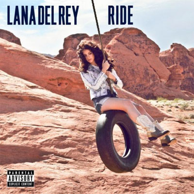


The font Lana uses on the titles is the same she uses for
every release. In doing this she has made a recognisable font that you tend to
associate with her music. The colours used in her promotion for “Ride” are all
quite classic colours- white, red, blue- these are the colours of the American flag,
which holds strong connotations of patriotism, which is unusual for Lana- as
she is, as I’ve already established an
indie/ alternative artist and normally has quite unconventional videos. Her video for ride is very usual for her,
and conforms to her audiences expectations, but the promotional imges ( such
as the one above with the American flag and buttwiser t shirt) is perhaps an attempt
to appeal to a wider audience range. All in all, the font, colours and images used all connote Lana's specific look that she has created herself through branding.
Subscribe to:
Comments (Atom)