Obviously, image as a musician is very important as well as the music itself, as all of our media today is linked with music videos and photographs- the colours & dress sense ect used are crutial in the attraction of followers. Text and image is a very important aspect of the branding of an artist, as what artists use as the front cover of a digipak for example, connotes certain things, attracting certain people.
Investigating of Lana Del Reys Marketing and promotion of her latest release " Ride"
Typing the title of the song into google images, images of her with the american flag come up all over the page which is a very iconic look she is going for. Here is a collection of images that she used on her blog, digipak and album to promote the song.
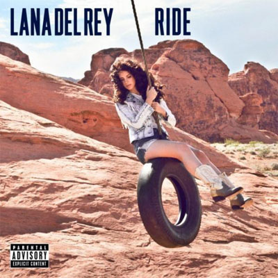


The font Lana uses on the titles is the same she uses for
every release. In doing this she has made a recognisable font that you tend to
associate with her music. The colours used in her promotion for “Ride” are all
quite classic colours- white, red, blue- these are the colours of the American flag,
which holds strong connotations of patriotism, which is unusual for Lana- as
she is, as I’ve already established an
indie/ alternative artist and normally has quite unconventional videos. Her video for ride is very usual for her,
and conforms to her audiences expectations, but the promotional imges ( such
as the one above with the American flag and buttwiser t shirt) is perhaps an attempt
to appeal to a wider audience range. All in all, the font, colours and images used all connote Lana's specific look that she has created herself through branding.
No comments:
Post a Comment