Here is the very first and very rough edit of my video! Currently the video says it is longer than it is- (this is because i accidentaliy left a clip floating around somewhere and forgot to delete it), but infact my video stops at 3 minutes 32 seconds. I know it isn't perfect yet by any means, but here is my first attempt! As you will notice there are changes from my animatic video. When editing I originally stuck to the animatic, but found the video lacking in variety, with each clip lasting for too long. As you will notice i have put the clips together at a faster pace to add variety. You will also notice that the order is also not exactly as i had planned, due to using the clips more frequently and i also chose not to put in the timelapse clip. I did this because i feel that it did not have the original desired effect and looked out of place. I also chose not to use any stop motion. I made this decision for a similar reason as i didn't add in the timelapse footage. It didn't fit in with the overall tone of the video, and i feel it could have worked if the song was more upbeat.
Tuesday, 29 January 2013
Tuesday, 22 January 2013


Monday, 14 January 2013
Ancillary Text / Planning 3- Digipaks & CD Cases
This is a Digipak >

A digipak is a specific style of CD Case, which is what i will be designing for my music video and song.
A digipak typically consists of a gatefold (book style), usually made from cardboard. A digipak consists of a plastic disc tray that has been glued inside a folded cardboard case. Digipak once referred specifically to the patented digipak packaging, however it has now become a genericized trademark that is now commonly used for any cardboard centred CD packaging.
As i said they are made from cardboard ( paper) and despite once being thought of as being environmentally freindy versions of CD Cases, they do have a higher manufacturing costs - another potential con of having a digipak is that they are more liable to potential wear and tear than jewel CD Cases ( wouldn't last if they got wet for example) , however CD Cases can easily be smashed.
 |
| This is a CD Case ^ |
Why there is more value on a digipak
Having 6 sides, a digipak gives me more opportunity for visual artwork as well as general information about the artist and their work. In doing this a person with the digipak can get a better feel for the artist, and it also gives more of a chance to promote, attracting more than just fans, as someone may see the digipak and just like the look of it- a CD case does not really do this and there is less to look at. A digipak is more of a collectable item with more accessible information than a CD Case.
What to include in my Digipak
- The artist name
- The album title
- The record company name
- The Copyright Label
- Lyrics
- Signiture of artist
- Album photographs ( taken whilst shooting)
- Barcode
- Disc holder
Thursday, 10 January 2013
Ancillary Text / Planning 2- Font testing
I know that i want a basic font, as that is what Lana Del Rey always uses. I also know that i want it to be a dark colour- black to be presice as i don't want to stray far from the artists usual branding. However i did try out, and experiment some different looking fonts to get a feel for what i am going for.


Wednesday, 9 January 2013
Ancillary Text / Planning 1- Promoting
I did some investigating on the internet about how musicians promte themselves. Now adays one of the most popular ways of promoting your music is through the use of music blogging websites, for up and coming musicians, however for already well established artists there are other methods. Here are the "Top Ten best websites to promote your music"
Typing the title of the song into google images, images of her with the american flag come up all over the page which is a very iconic look she is going for. Here is a collection of images that she used on her blog, digipak and album to promote the song.


Obviously, image as a musician is very important as well as the music itself, as all of our media today is linked with music videos and photographs- the colours & dress sense ect used are crutial in the attraction of followers. Text and image is a very important aspect of the branding of an artist, as what artists use as the front cover of a digipak for example, connotes certain things, attracting certain people.
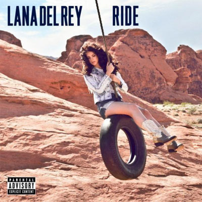
Investigating of Lana Del Reys Marketing and promotion of her latest release " Ride"
Typing the title of the song into google images, images of her with the american flag come up all over the page which is a very iconic look she is going for. Here is a collection of images that she used on her blog, digipak and album to promote the song.


The font Lana uses on the titles is the same she uses for
every release. In doing this she has made a recognisable font that you tend to
associate with her music. The colours used in her promotion for “Ride” are all
quite classic colours- white, red, blue- these are the colours of the American flag,
which holds strong connotations of patriotism, which is unusual for Lana- as
she is, as I’ve already established an
indie/ alternative artist and normally has quite unconventional videos. Her video for ride is very usual for her,
and conforms to her audiences expectations, but the promotional imges ( such
as the one above with the American flag and buttwiser t shirt) is perhaps an attempt
to appeal to a wider audience range. All in all, the font, colours and images used all connote Lana's specific look that she has created herself through branding.
Subscribe to:
Comments (Atom)